The number nobody rebalanced on
The number that broke the 60/40 is +0.15, which is exactly why it was missed.
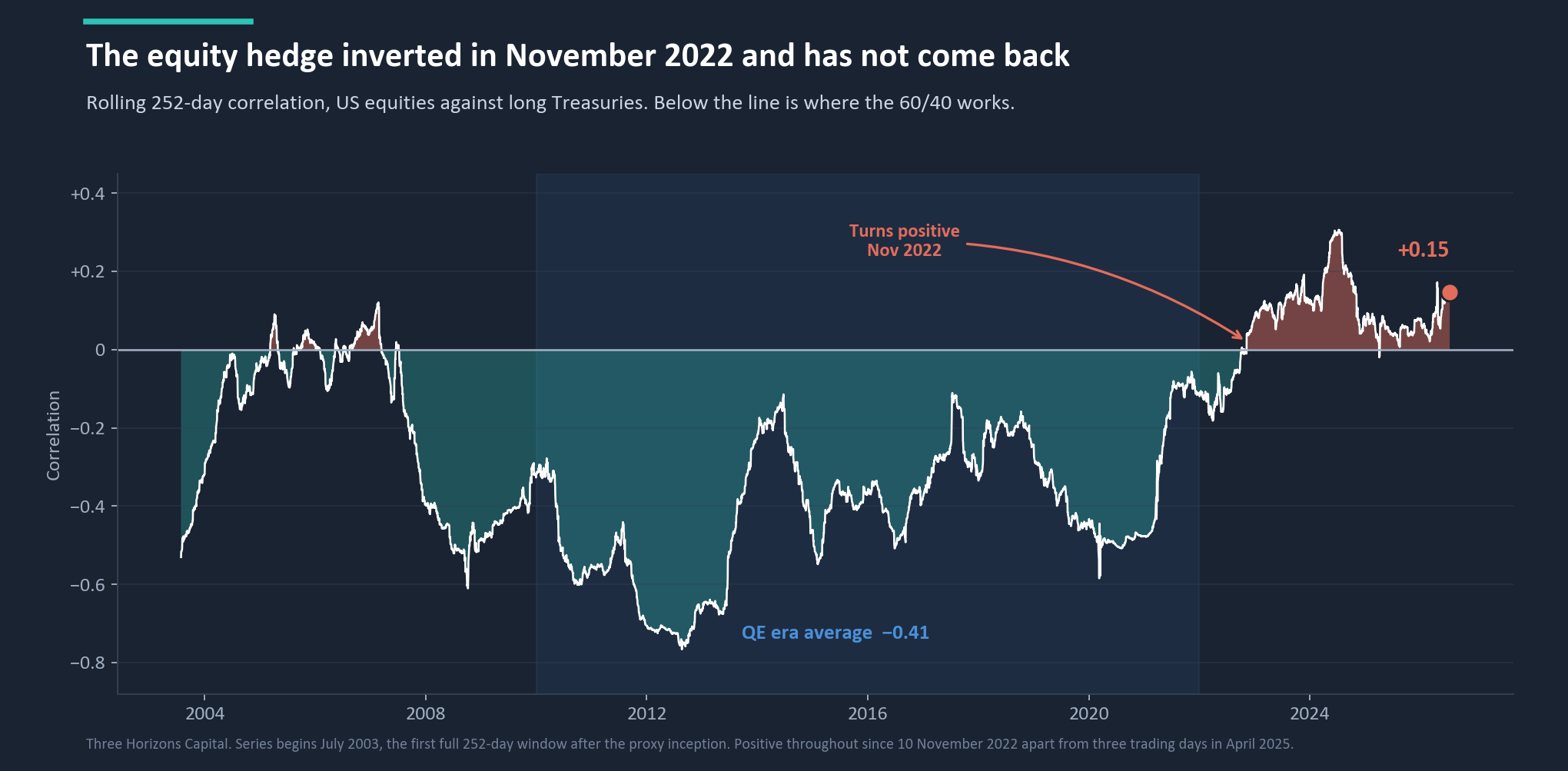
Nobody rebalances on +0.15. It is a small number, an unalarming number, and it lives in a cell of a spreadsheet that most investment committees have never opened. That is the entire problem. The 60/40 portfolio does not work because bonds out-return cash. It works because of a mechanism: when equities fall, bonds are supposed to rise. That mechanism is not a return assumption. It is an assumed negative correlation. And it is no longer negative.
Between 2010 and 2021 the relationship between US equities and long Treasuries averaged −0.41. Bonds did their job mechanically, without anyone having to be right about anything. It turned positive in November 2022 and, with the exception of three trading days in April 2025, has stayed positive ever since. That is three years and eight months in which the cushion has not been a cushion.
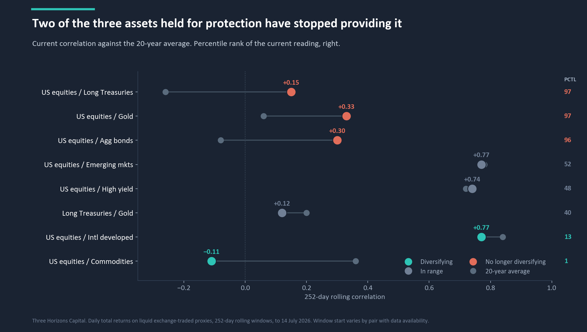
Look at the pair most portfolios actually hold, equities against the aggregate bond index rather than long Treasuries, and the reading is +0.30, the 96th percentile against a twenty-year average of −0.08. A thirty per cent allocation held as a stabiliser is not stabilising. It is not adding much risk either. It is simply not doing the thing it is in the portfolio to do.
What this tells you: This is not a claim that bonds are a bad asset. Income and credit still work. The specific function that has stopped is duration acting as an equity hedge, which is a narrower claim than “the 60/40 is dead” and the one the data actually supports.
The counter-intuitive one
Gold stopped hedging equities, and its best year in a decade is the reason.
Gold historically earned its place by having almost no relationship with equities. It averages +0.06 over our full history and spends long stretches slightly negative. It was the asset that did not care what the equity market was doing, and that indifference was the product being bought. It now sits at +0.33, the highest in eleven years and the 97th percentile of twenty.
What is driving it is not fear. It is central bank reserve accumulation and the slow diversification away from the dollar. That is a monetary story rather than a risk-off one, and it changes the sign of the relationship: when the common driver is the currency, a weaker dollar lifts the dollar price of gold and supports risk appetite at the same time. The metal goes up because the currency is being diversified away from, not because investors are frightened.
One correction worth making plainly, because our own source material overstated it. This is not a record. The correlation reached +0.44 in April 2010, higher than today. An eleven-year high is enough.
What this tells you: Gold is currently a currency and geopolitical position, and a defensible one. It is not an equity hedge. Sizing it as though it were means holding something that will fall alongside the very thing it was bought to offset.
The one that is working
The only thing genuinely diversifying is the thing almost nobody owns.
Commodities sit at −0.11 against US equities, against a twenty-year average of +0.36. That is the 1st percentile. In nineteen and a half years of daily data this relationship has been negative in only two brief episodes: a few weeks in the autumn of 2008, and now, continuously since late April 2026.
The mechanism is trade policy. Commodity demand has been suppressed by weaker Chinese industrial activity and disrupted trade flows, while US equities have run on domestic technology and nearshoring narratives. One macro force, two asset classes pulled in opposite directions by it.
We should be equally clear about the other half, because it determines how you use it. This is a condition, not a property. The +0.36 long-run average is the honest number, and this will revert when global growth re-synchronises or the trade disruption is absorbed. Anyone selling a permanent commodity allocation on the strength of a 1st-percentile reading is selling the wrong thing.
One cause, three symptoms
This is a regime, not a run of bad luck.
Inflation has returned as a portfolio-relevant factor after roughly forty years of absence, and that single change explains all three anomalies. When growth is the dominant factor, equities and bonds respond to it in opposite directions: weak growth hurts earnings and lowers policy rates, so bonds rally as equities fall. When inflation is dominant, they respond in the same direction, because rising inflation expectations lift the discount rate on equity earnings and push bond yields up together. The hedge does not weaken. It inverts.
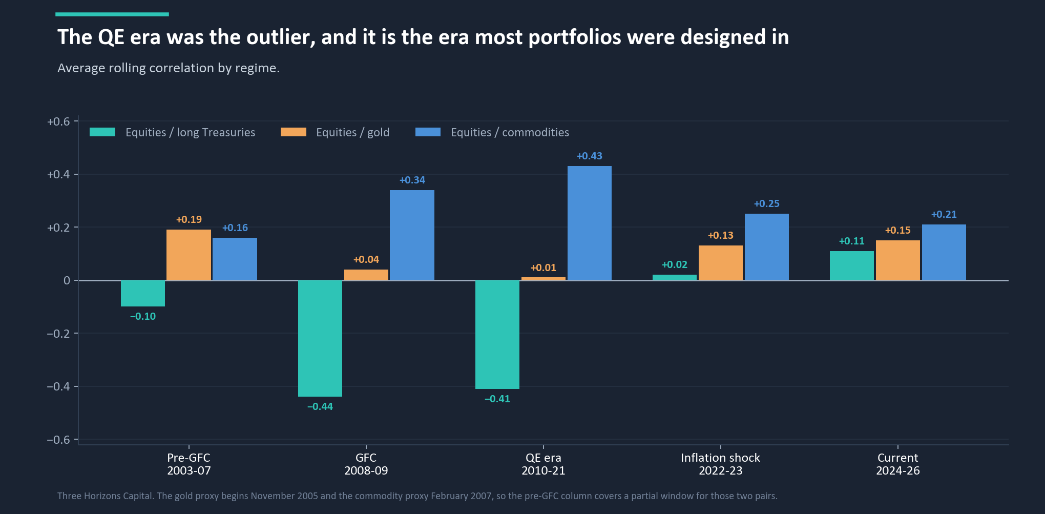
The regime history makes the point that ought to worry an allocator most. The QE era shows −0.41 on stocks and bonds, the most reliably negative reading in the series. That was the environment in which the current generation of strategic asset allocations was built, tested and signed off. It was also the most favourable diversification environment of the last two decades, and the furthest from where we are now.
The uncomfortable part
The assumptions already knew. The portfolios did not.
The obvious version of this story is that the industry's forward-looking models are stale, still calibrated to a world that ended in 2022. It is a satisfying story. We checked it, and it is not true. The 2026 long-term capital market assumptions we cross-reference already put US large-cap equities against aggregate bonds at +0.295. The realised twenty-year-window reading is +0.30. On the single relationship that defines the 60/40 portfolio, the assumption set and the market are in almost exact agreement.
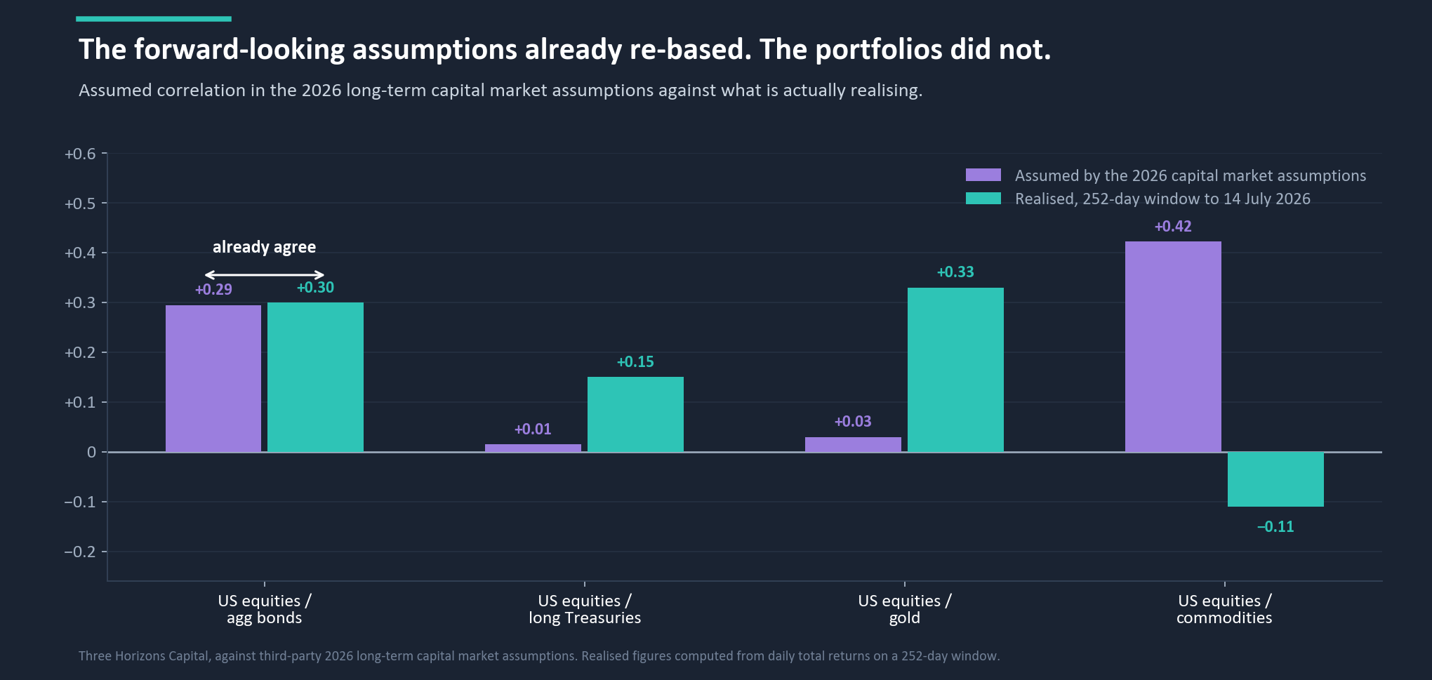
What this tells you: This is not a forecasting failure, in which better inputs would have produced a better answer. It is an implementation failure. The assumption sets updated, the allocations built on top of them did not get rebuilt, and the gap has been sitting in documents that investment committees approve every year. The fix requires no view.
Two relationships have not re-based, and they are where a standard model is furthest from the world. Gold is assumed at +0.03 against equities and is realising +0.33, a gap of thirty correlation points. Commodities are assumed at +0.42 and are realising −0.11, a gap of fifty-three. Neither is the one anybody is talking about.
The rebuild
Rebuilt around what diversifies today, the same return costs less risk.
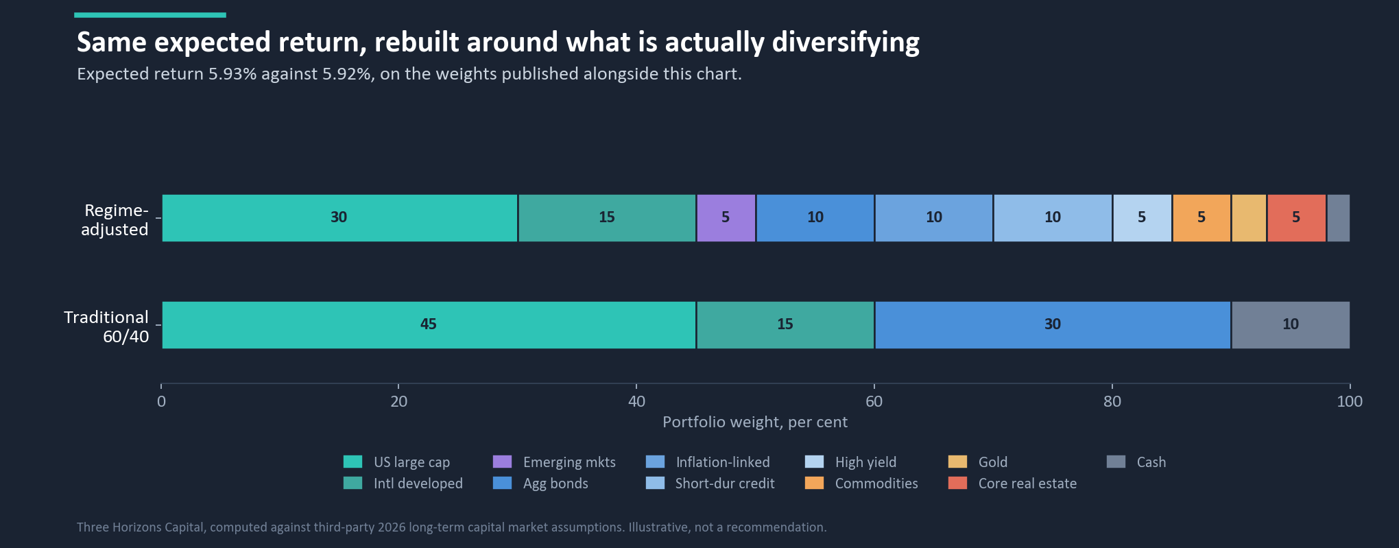
The rebuilt portfolio delivers the same expected return as the traditional 60/40, 5.93% against 5.92%. It also carries less risk, though how much less turns out to be a question the standard tools cannot answer.
| Asset class | 60/40 | Regime-adjusted |
|---|---|---|
| US large cap | 45% | 30% |
| Developed international equity | 15% | 15% |
| Emerging markets equity | 0% | 5% |
| US aggregate bonds | 30% | 10% |
| Inflation-linked bonds | 0% | 10% |
| Short-duration credit | 0% | 10% |
| US high yield | 0% | 5% |
| Commodities | 0% | 5% |
| Gold | 0% | 3% |
| US core real estate | 0% | 5% |
| US cash | 10% | 2% |
| Total | 100% | 100% |
Fixed income is restructured, not removed: the aggregate position comes down from 30% to 10%, redeployed into inflation-linked bonds, short-duration credit and a small high-yield position. Total fixed income actually rises, from 30% to 35%. It is the composition that changes, not the size, because duration is the component that has turned against the portfolio. Commodities go from nothing to 5%, sized small precisely because the condition will not last. Gold is introduced at 3% as a currency position rather than an equity hedge. Equity comes down from 60% to 50% and improves in shape, retaining developed international exposure that is worth more than usual at the 13th percentile.
Why there is no number here
No standard portfolio model can represent what we just measured.
We had intended to publish the size of the volatility reduction. We are not going to. Running these exact weights through the same engine, the reduction moves by an order of magnitude depending on two entirely defensible modelling choices: how a short-duration credit sleeve is mapped to a modelled asset class, and which correlation matrix is used underneath. Three people computing the same portfolio produced three different answers, and none of them was wrong. A benefit that moves that much on choices the analyst makes is not a finding about the portfolio. It is a finding about the model.
There is a second reason, and it goes to the heart of this piece. The published capital market assumptions carry gold at +0.03 against equities. The realised-correlation datasets that might correct it do not cover gold at all. And there is no current-regime correlation setting in a standard modelling stack: the choice is a published long-run matrix or a twenty-year average, and both of them say gold diversifies.
What this tells you: The model credits gold with protection the data says it stopped providing, and charges you for a commodity correlation you are not currently experiencing. What survives is the part that does not depend on any of it: the expected return, which involves no correlation input at all, and the direction of the risk change, which was consistent across every combination we tested.
Testing it properly
Then we checked whether the stress test was looking at what we had bought.
Our previous piece found that the standard six-scenario stress library applies no shock at all to several asset classes, so a portfolio can appear more resilient simply by moving into buckets the test does not examine. Having published that, we were not going to run the same test on a new portfolio and report the result without checking. It is the same problem in a milder form. Thirty per cent of the rebuilt portfolio is invisible to every one of the six scenarios, against fifteen per cent of the traditional portfolio, and every percentage point of the rotation was funded out of buckets the library shocks in every scenario.
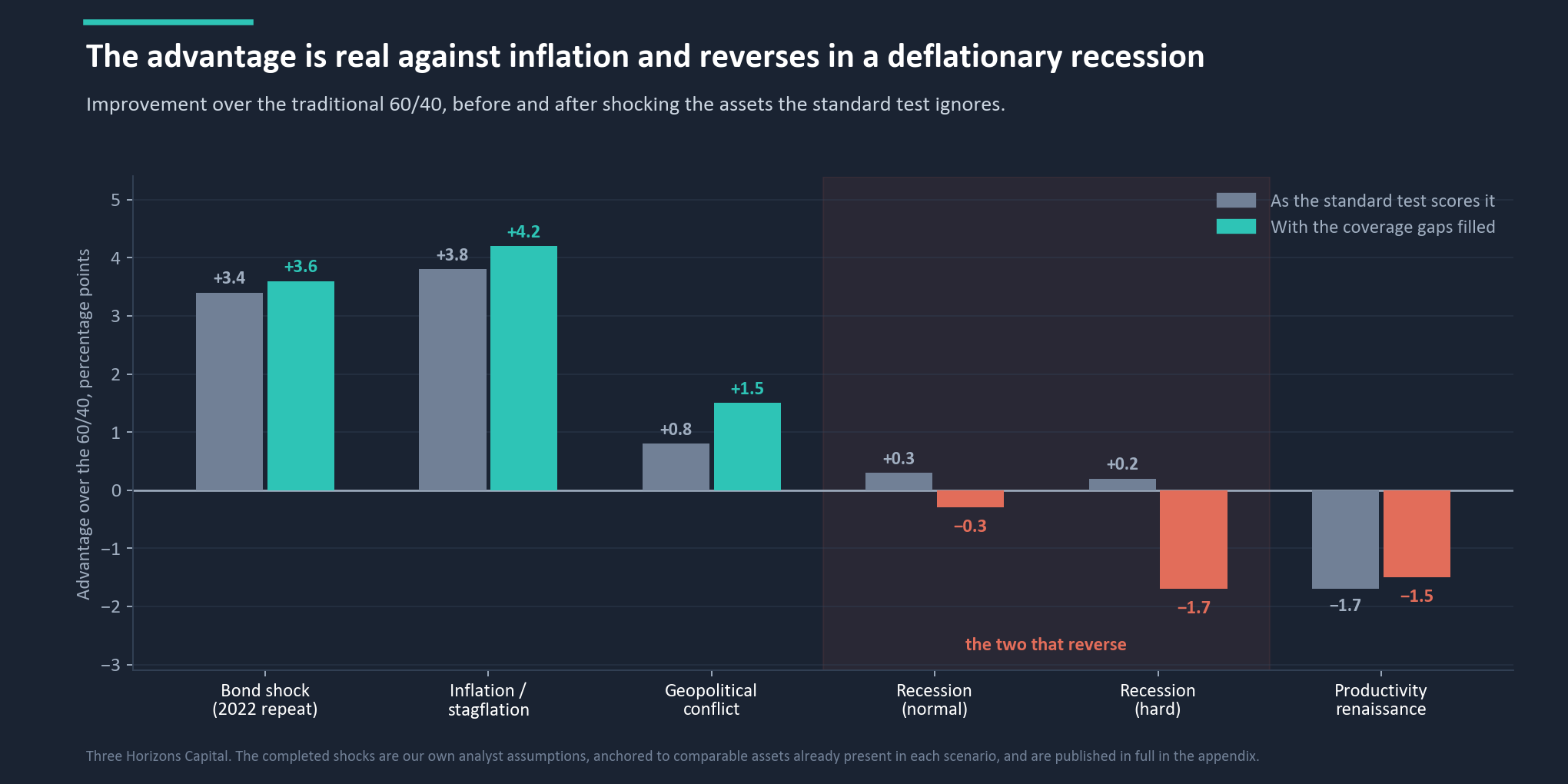
So we completed the test, assigning each missing bucket a shock anchored to an asset already present in that scenario with the same economic character. These are our assumptions, not calibrated data, and the full vector is published in the paper so anyone who disagrees can substitute their own.
| Scenario | As scored | Gaps filled |
|---|---|---|
| Bond shock, a 2022 repeat | +3.4pp | +3.6pp |
| Inflation and stagflation | +3.8pp | +4.2pp |
| Geopolitical conflict | +0.8pp | +1.5pp |
| Recession, normal | +0.3pp | −0.3pp |
| Recession, hard | +0.2pp | −1.7pp |
| Productivity renaissance | −1.7pp | −1.5pp |
Two things follow, and they point in opposite directions. The core argument survives and strengthens: in the two scenarios this repositioning exists to address, the inflationary ones, the advantage is real and gets larger once the missing assets are shocked properly. But the two recession scenarios reverse, from narrow wins to losses, because commodities fall hard in a deflationary crash and the standard test was scoring them at zero.
A third finding applies to everybody. The standard test understates the absolute drawdown for both portfolios, by between two and seven percentage points depending on the scenario, because fifteen per cent of even the plain traditional 60/40 sits in a bucket it never shocks. In a hard recession the traditional portfolio's modelled loss moves from −19.9% to −27.3% once developed international equity is shocked properly. If you have been shown a stress test on a multi-asset portfolio recently, the first question worth asking is not what the number was. It is which of your holdings the test had a shock for.
What this actually is
Not a free improvement. A decision about which risk you are protecting against.
Rebuilt this way, the portfolio is materially better if the thing that hurts you is inflation: a rate shock, a stagflationary squeeze, cost-push pressure that will not subside. It is modestly worse if the thing that hurts you is a deflationary recession, because the assets that diversify against inflation are not the assets that protect against a credit crunch. And it gives up around a point and a half of upside if the current expansion continues uninterrupted.
That is a real trade, with a real cost, and it should be made deliberately. What it should not be is made by default, which is what holding the QE-era structure now amounts to. The traditional 60/40 is itself a bet: that the negative stock-bond correlation returns. For a decade that was a free assumption, indistinguishable from prudence. Today it is an active position, and most of the people holding it do not know they are holding it.
When we would change our minds
This reverts, so here is the number we watch.
Every anomaly in this piece is a condition rather than a property. The single most important number is the 252-day rolling correlation between US equities and long Treasuries. When it sustains below −0.10 for a month or more, the mechanism that made the traditional structure work has re-established itself, long-duration bonds become genuine stabilisers again, and the case in this piece weakens considerably. It is one line, computable weekly from public prices.
Three secondary triggers matter. If the equity and commodity correlation rises back above +0.20 on a sixty-day basis, the tactical commodity position has done its job and should come down. If the equity and gold correlation falls back below +0.10, gold has become a diversifier again and can be sized as one. And if core inflation settles durably below 2.5%, the common factor driving all of this has gone and the diagnosis should be reopened.
What this tells you: Labels are the enemy throughout. “Stabiliser”, “safe haven” and “diversifier” describe what an asset used to do. Only the data describes what it is doing now. Diversification did not disappear. It moved, and it will move again.
Sources and basis
Correlations are 252-day rolling Pearson correlations computed on daily total returns for liquid exchange-traded proxies covering US large-cap equities, long Treasuries, aggregate bonds, gold, developed international equities, emerging market equities, high yield credit and broad commodities, from each proxy's inception to 14 July 2026. Percentile ranks are computed against the full available history for each pair, not a common window, and the differing start dates are stated in the paper. Portfolio expected returns are computed against third-party 2026 long-term capital market assumptions on the weights published above and are compound rather than arithmetic. Portfolio volatilities and risk-adjusted return ratios are not published, for the reasons set out above. Scenario outcomes are computed by linear shock propagation, in which an asset with no shock defined receives a shock of exactly zero; all six base cases have been independently reconciled against the scenario engine's own asset-level shock vectors. The completed stress shocks are analyst assumptions constructed by Three Horizons Capital, not calibrated data, and are published in full in the paper. Correlations are period-dependent and may not persist. Market data as at 14 July 2026. For professional investors; not investment advice. Asset classes referenced are examples, not recommendations.