Fixed income
The Signal You Can Trust Is Not the One That Can Hurt You
Government bond yields across Europe and the other major markets have risen to their highest levels in years. We went back and found seven earlier times the same thing happened. What came next was reliable in one market and violent in another, and not the market most people are watching.
Three Horizons Capital · 7 September 2026 · Government bond yields are quoted in each market's own currency. European fund-flow figures are in euro. Equity figures are in US dollars. Our own government bond histories cover Germany, the United Kingdom, Japan, Canada and the United States and begin between 1970 and 2001 depending on the market. For professional investors. No fund, manager, issuer, client or individual is named anywhere in this note.
42nd or 99.5th
where the same American yield sits in its own history, depending only on how far back you look
7 of 7
earlier episodes in which the average yield across our five markets was lower two years later
2 of 7
of those same episodes in which the equity market was also lower two years later
The finding in one line
Across seven comparable episodes the bond outcome was consistent and the equity outcome was not. The thing you could have predicted was not the thing that could have hurt you.
The high is real. The extreme depends on where you start.
Every one of the five government bond markets we hold has printed a multi-year high this month. That much is not in dispute, and it is the part every allocator has read.
The natural next question is how unusual it is. The natural way to answer it is to rank today's yield against that market's own history, which tells you what share of all the days ever recorded were below today. That number is easy to produce and it is quoted constantly.
It is also almost entirely a product of a decision nobody mentions: how far back you look.
| Market | Latest | Rank in its own full history | Rank since 2010 | Our history begins |
|---|---|---|---|---|
| Germany | 3.37% | 59th | 98.6th | 1997 |
| United States | 4.77% | 42nd | 99.5th | 1970 |
| Canada | 3.79% | 71st | 98.9th | 2001 |
| Japan | 2.94% | 75th | 99.9th | 1986 |
| United Kingdom | 5.08% | 82nd | 99.8th | 1996 |
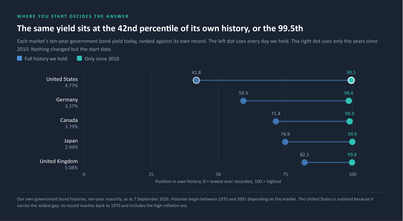
The same number, on the same day, from the same data. On its full history the American ten-year sits below its own median. Measured only against the years since 2010, it is at the 99.5th percentile, effectively as high as it has ever been. That is a fifty-eight point swing on one number, and the only thing that changed was the start date.
Germany moves from the 59th percentile to the 98.6th the same way. Ours is the widest gap because our American series begins in 1970 and includes the high-inflation era. Truncate that American series to 1990 and it reads 65th instead of 42nd. Neither is wrong. Only one of them will be quoted.
WHAT THIS ACTUALLY TELLS YOU
"The highest since 2011" is a statement about the last fifteen years. It is not a statement about how extreme today is, and the two get confused constantly. If the last decade was the unusual period, then a fifteen-year high is a return to normal wearing the costume of an emergency. Before acting on any percentile, ask what window produced it. In our own data the answer changes the conclusion.
Where our map ends. We hold government bond histories for Germany, the United Kingdom, Japan, Canada and the United States. We do not hold sovereign yield curves for France, Italy or Spain, and we do not hold a thirty-year gilt. The widely circulated French, Italian and Spanish figures, and the thirty-year gilt figure, are not ours. They are not used anywhere in this note, and nothing here depends on them.
The money did not leave
If a rise in yields of this size were a market fleeing government debt, it would show up in where money actually went. A yield can move on opinion. A flow requires somebody to act.
We looked at the three groups of European bond funds we track, weekly.
| Group | Weeks with money coming in, of the last eight |
|---|---|
| European government bonds | 6 of 8 |
| European corporate bonds | 2 of 8 |
| European high yield and broad | 1 of 8 |
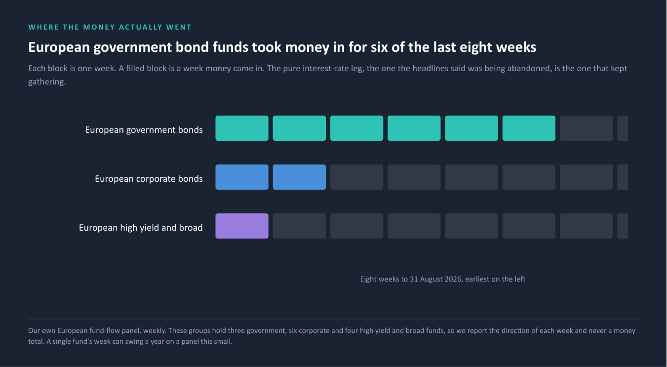
The government leg, the pure interest-rate leg, the one the headlines said was being abandoned, took money in for six of the last eight weeks. It only turned negative in the final two. The credit legs are the ones that have been losing money steadily.
Over the last twelve months the same holds, and it survives a test the shorter numbers do not.
A CAUTION WE WOULD RATHER STATE THAN BURY
These groups contain very few funds: three government, six corporate and four high yield and broad. On a panel that small a single fund's week can swing a year, and here it does. Remove only the single largest week from each group's twelve-month total and the corporate figure flips from positive to a deficit of nearly four billion, and high yield flips too. The government figure does not flip. It stays positive either way.
That is why we quote the direction and the count of weeks, and never a money total. Anyone quoting you an annual flow number for European corporate bonds is quoting you one week.
What survives that test is the only thing worth saying: over the last year, the one European bond group whose intake does not depend on a single week is government debt, and it took money in.
Why the week and the year disagree
There is a reason the latest week points one way and every longer window points the other, and it is not noise.
In work published earlier this month we measured how much of each bond group's month-to-month movement lines up with what the news was discussing at the time. In the American market, roughly nine tenths of the movement in corporate debt tracked the news. Under a fifth of the movement in government debt did.
Those are two different kinds of money. One is a sentiment position: it arrives on a story and it leaves on one. The other is the slow business of matching cash to obligations, which starts for its own reasons and stops for its own reasons.
The European picture has the same shape. The themes moving European corporate and high yield flows are dominated by energy and fuel prices. The themes moving European government flows are diffuse, with no single driver.
WHY THIS MATTERS MORE THAN THE DIRECTION
A news-driven leg turns over inside a week, because news does. A structural leg does not. So when a one-week reading and a one-year reading disagree about government bonds, the longer one is describing the thing that is actually happening and the shorter one is describing weather. That is not a general rule about data. It is a specific consequence of what each leg is made of.
And what we will not do with it. We are not putting a European number on this. The European version of that measure returns values outside any coherent range, so we use its shape and never its level, and we do not compare it numerically with the American reading.
Seven times before
If the government leg is structural rather than a panic, then the useful question is not what it is doing this week. It is what happened the last times it looked like this.
We defined a comparable episode as a month in which the average position of our five markets was at or above the 66th percentile of their own histories and every single one of the five was above its own median, so that the episode is genuinely broad rather than one country running hot. Under that definition, seven earlier episodes qualify. Today qualifies too.
And today's average sits at 3.99 per cent, lower than six of those seven and higher than only one. The current episode is the second least elevated in the record, on the same measure that put it in the record in the first place. A reader who has been told this is the highest level in over a decade and a reader looking at that table are both correct, and only one of them is looking at a comparison.
| Episode peak | Months in the episode | Average yield at the peak | After 12 months | After 24 months |
|---|---|---|---|---|
| January 2001 | 1 | 4.33% | +5bp | -69bp |
| February 2002 | 2 | 4.34% | -80bp | -64bp |
| August 2003 | 1 | 3.93% | -6bp | -64bp |
| October 2003 | 1 | 4.02% | -28bp | -40bp |
| June 2004 | 4 | 4.14% | -90bp | -4bp |
| June 2006 | 5 | 4.10% | +20bp | -24bp |
| June 2007 | 11 | 4.30% | -45bp | -121bp |
| September 2026 | 3 so far | 3.99% | not yet | not yet |
Each episode is named for its peak month, the month inside it at which the average of the five markets was highest, and every forward window in this note runs from that peak month, here and in section 06. Several episodes run longer than a month. The June 2007 episode spans eleven, from December 2006 to October 2007. The current one has run three so far, from July.
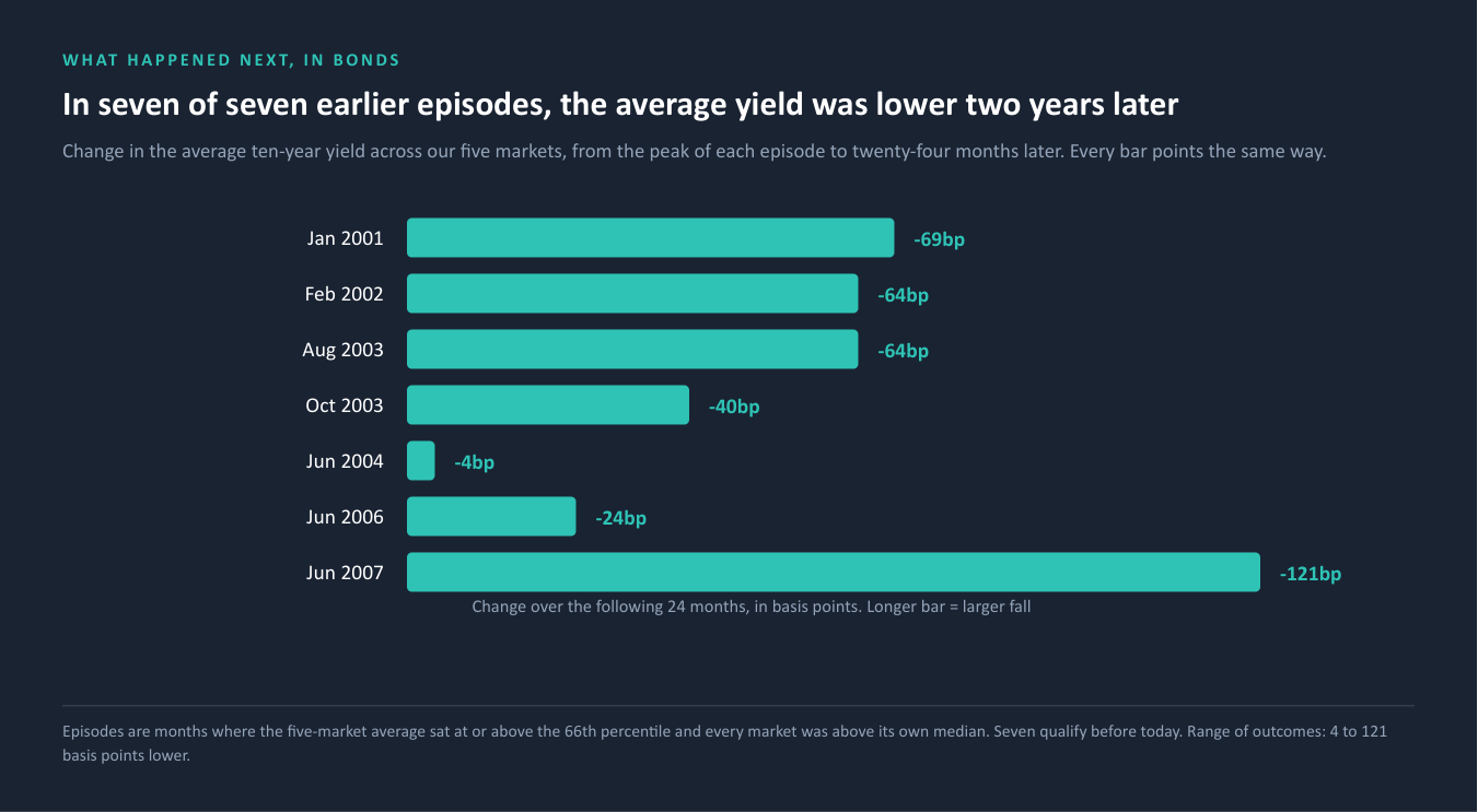
In seven of seven, the average yield was lower two years later, by between four and 121 basis points. Five of seven were already lower at twelve months. The three-month reading is the only genuinely mixed one.
And because section 01 was about windows, we tested this one against its own. Run the identical screen on a strict full history and no month in the record qualifies at all, because the American yield sits below its own median. Run it on a window where all five markets start together, and ninety-nine months qualify. The count of episodes is a choice.
THE PART THAT SURVIVED THE TEST
The number of episodes depends entirely on the convention. The direction of what followed does not. Under every convention we tested that produces episodes at all, the average yield was lower two years later in almost every one. The level question has no stable answer. The direction question does. That is the difference between a fact and an artefact, and it is worth more than either number on its own.
But not yet
Two things point the other way in the near term, and we would rather show the tension than resolve it.
Market pricing of an American rate rise this month has moved from roughly one third to roughly two thirds in about a fortnight, following remarks at the annual central bankers' gathering in late August. That is public market pricing, not our measurement, and we label it as such.
Our own inflation nowcast, which runs across forty economies and updated this morning, has seven of the eight largest developed economies at or above 2.5 per cent. France is the exception at 1.83 per cent, below both that line and the European Central Bank's own target. Growth readings are mostly positive.
Our own structural model of American policy reads it as modestly accommodative, and its nearest historical parallels lean towards easing rather than tightening. That model was last updated at the end of June, and it has not absorbed what has happened since.
STATED PLAINLY
The base rate in section 04 pulls slowly downward. The live pricing pushes quickly upward. Our own policy model disagrees with the market and is two months out of date. We are not going to resolve that for you, because resolving it would mean guessing on your behalf and presenting the guess as analysis. What an allocator can act on is the shape: a slow structural pull against a fast news-driven push, running on different clocks. Section 03 already told you which of those two turns over faster.
The signal you can trust is not the one that can hurt you
Now the question that matters. In those seven episodes, where did the damage actually land?
We rebuilt the American equity market through every one of them from our own security-level prices, using the index membership as it stood on each date so that the answer is not flattered by the companies that survived.
| Episode peak | Equity, after 24 months | Worst fall at any point in those 24 months |
|---|---|---|
| January 2001 | -34.4% | -38.0% |
| February 2002 | +9.0% | -24.6% |
| August 2003 | +25.3% | -0.7% |
| October 2003 | +18.5% | 0.0% |
| June 2004 | +15.3% | -3.4% |
| June 2006 | +5.9% | 0.0% |
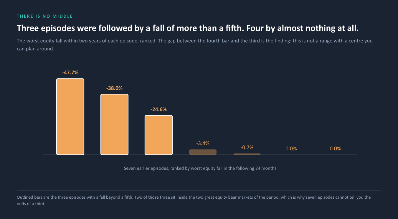
| June 2007 | -33.9% | -47.7% |
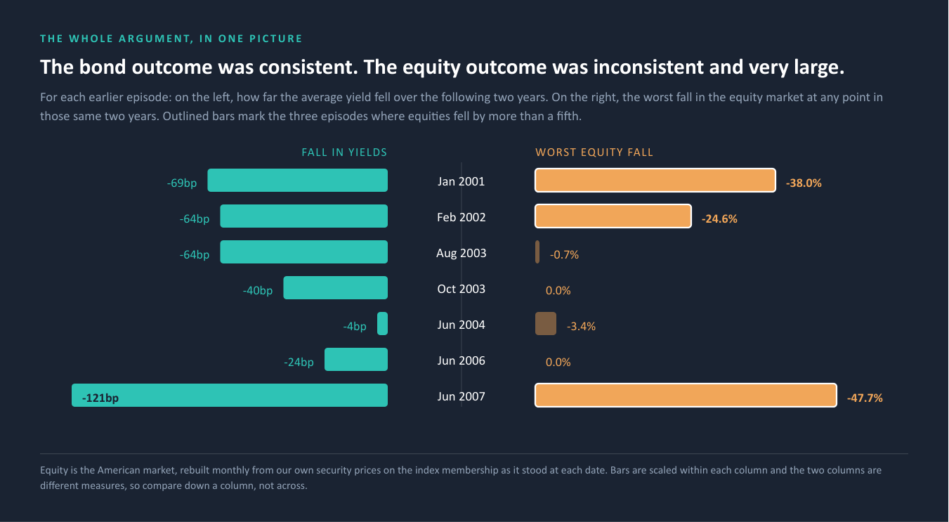
Equities were lower two years later in two of the seven, not seven of seven. In five they were higher, in one case by a quarter. Anyone telling you that a broad rise in government yields reliably ends in an equity fall is not describing this record.
But look at the final column, because that is where the argument is.
Three of the seven episodes were followed by a fall of more than a fifth, of 24.6, 38.0 and 47.7 per cent. The other four were followed by essentially nothing at all: worst falls of zero, zero, 0.7 per cent and 3.4 per cent. There is no middle. The equity outcome is not a spectrum with a central tendency you can plan around. It is two outcomes, one of them unremarkable and one of them severe, and nothing in between.
THE PRACTICAL CONSEQUENCE
Set the two columns of this note side by side. The government bond outcome was consistent: lower every single time, by four to 121 basis points. The equity outcome was inconsistent and very large: nothing at all in four episodes, and between a fifth and a half in three.
The reliable signal was in the market whose direction was never much in doubt. The market that could hurt you badly gave no reliable signal at all.
That is not an argument about where yields go next. It is an argument about where risk budget goes. A book that responds to a government bond high by rearranging its government bond holdings has spent its attention on the column where the direction was never in much doubt, and left untouched the column where the outcome ranged from nothing to minus half.
Where this could be wrong, and it is the most important limit in the note. Three of those drawdowns sit inside or just ahead of the two great equity bear markets of the period. Seven episodes drawn from twenty-six years that happen to contain two bear markets cannot tell you the probability of a third. We are describing what happened. We are not forecasting, and the moment this is read as a forecast it is being misused.
What we did not write
Seven claims were available in the work behind this note. Each would have made it tidier. None of them is here.
1. We were asked which of our clients this affects. We said no. We answer each client from that client's own work and nothing else, and we hold no register anywhere that would let us screen one client's exposure against another's. Both of those are deliberate, and the wall runs in both directions.
2. We could have given you a probability. Asked for the likelihood of a further move, we could have produced a percentage. We do not hold a model that calibrates event probabilities, so what we have given instead is a base rate over seven episodes, labelled as a base rate. A percentage would have been more satisfying and would have been invented.
3. We could have estimated a portfolio's exposure. We did not. Asked to run a rate shock through a book whose holdings we did not have, we declined to assume its weights and asked for them instead. An estimate would have looked like an answer.
4. Our own European corporate credit spread series is producing impossible values. It has been returning negative investment-grade spreads for months, which cannot be true and points to a fault in how the series is built. We could have quoted it. We are telling you it is broken, and no conclusion in this note rests on it.
5. We could have told you last week's government outflow was news-driven. The model that separates news-driven money from structural money has not produced a complete reading for roughly fifteen weeks, so it cannot support that claim about that week. We used the eight-week and twelve-month evidence instead, which it can.
6. We could have put a European number on the news-driven share. The European version of that measure returns values outside any coherent range. We used its shape and left the number out.
7. We found our own market data repeating itself. One of our five government bond feeds has printed the identical value for six consecutive observations, and two others repeated across three, while outside quotes moved. We found it, it is being fixed, and we would rather you heard it from us than discovered it in a number we gave you.
WHY THIS SECTION IS HERE
You cannot verify our accuracy from a document. What you can verify is whether a firm tells you what it does not know before you ask. Every one of the seven items above was available to be quietly left out, and leaving them out would have made this a more confident note and a less useful one.
What an allocator does about it
Three questions. None needs a new mandate, a new manager or a new system, and all three can be answered against a book you already hold.
1. Which book are you managing this in? If a government bond high has prompted a review of the government bond sleeve and nothing else, section 06 says that is the sleeve where the outcome was least in doubt. The column with the range from zero to minus half was somewhere else.
2. Which window is your position justified on? Take one European bond sleeve. Write down its flow over one week, over eight weeks, and over twelve months. If the three disagree, that is information rather than noise. The position most likely to be wrong is the one built on the shortest window, because section 03 explains which leg turns over fastest.
3. What date is on the number you are acting on? Not the day you read it. The day it was measured. A number without a date attached is not a fact anyone can audit, and it is the most common weakness in an investment case that later looks unlucky rather than wrong.
The check in full, so you can run it without us. Pick one sleeve. Three windows. Write the measurement date beside each. Then ask which window the original case was built on. If the shortest is the only one that supports the position, you are holding a trade rather than a holding, and it should be governed as one: a shorter review cycle and an explicit trigger, because the thing that would invalidate it moves faster than a quarterly meeting.
Where most people stop. Two steps in, most books cannot state the measurement date on their own market data, and almost none can separate money moving on news from money moving on obligations. That is the wall. It is the point at which this stops being a checklist and becomes a question about the plumbing rather than the portfolio.
What we measured, and what we did not
Government bond yields. Ten-year yields for Germany, the United Kingdom, Japan, Canada and the United States, from each market's own official source, with histories beginning between 1970 and 2001. Percentiles are each market's rank within its own full recorded history unless another window is stated. We do not hold France, Italy or Spain, and we do not hold a thirty-year gilt.
Episodes, and why the American series starts in 1990 for this screen. Episodes are defined on month-end readings as an average position at or above the 66th percentile with every market above its own median.
That screen is a statement about five markets at once, so every market's rank has to be measured over a comparable period. Our American series reaches back to 1970 and is the only one that does. The others begin between 1986 and 2001. Ranking the United States against the high-inflation era of the 1970s, when double-digit yields were normal, while ranking Germany and Canada only against the period since the late 1990s, does not compare like with like: it holds one market to a standard none of the others were ever measured against, and mechanically depresses its rank. Cutting the American series at 1990 gives every market its full available history within the one regime they all share.
The alternative conventions are worse for this purpose rather than better. Running every market from 2001, where all five overlap, is the strictest comparison and discards fifteen years of real Japanese history and four of German. Running every market over its own full record reintroduces exactly the incomparability described above.
We publish the convention because the convention is doing work, and section 04 shows what happens under the alternatives. The honest summary is that the number of episodes is convention-dependent and the direction of what followed is not, which is why this note leans on the second and not the first.
European bond flows. Weekly, three groups, containing three government, six corporate and four high yield and broad funds. Figures are in euro. Direction and week counts only, never money totals, for the reason given in section 02.
The news measure. Reliable for ranking groups against one another, which is how we use it, and not precise enough to defend a decimal, which is why section 03 quotes roughly nine tenths and under a fifth rather than a number.
Equity. The American index rebuilt monthly from our own security-level adjusted prices on the index membership as it stood at each date, capitalisation-weighted on the prior month's market values. Between 447 and 464 members carried a usable price in a listed membership of roughly 520 to 540. All of the missing names exist in our price data, and of the forty-one gaps at one tested date, thirty-six were still index members three years later, so the gaps are coverage rather than failures. Twenty individual monthly observations across a decade were excluded as implausible.
How we know the rebuild is sound. Run against four calendar years including both crisis years, it returns -21.1 per cent for 2002 against a published -22.1, +29.2 for 2003 against +28.7, -36.0 for 2008 against -37.0, and +27.7 for 2009 against +26.5. Within about one percentage point in all four.
Inflation. Our own nowcast across forty economies, updated the morning this note was written.
What we did not do. We have offered no view on where interest rates go next, and nothing here rests on what any policy meeting decided. We have not measured a bond index total return, because we do not hold one, so the bond side of section 06 is stated as a yield change and not as a return. The historical work covers the five markets we hold, Germany, the United Kingdom, Japan, Canada and the United States. France and Italy are not in it, so it is not a G7 measure and we do not describe it as one. The equity rebuild is American. Neither is European, and this note does not claim otherwise.
Where this could be wrong. The equity finding rests on seven episodes from a period containing two bear markets. If the European government leg loses money for a third, fourth and fifth consecutive week, the eight-week evidence in section 02 converges on the one-week reading and that section weakens. That is visible within a month and we will say so if it happens.
If this is useful
Three ways in. None of them requires a mandate.
Take the check and run it yourself. Section 08 is the whole method. It needs nothing from us and no data you do not already have.
Or send us one line naming a bond sleeve you hold. We will come back with a single page: which window the case for it rests on and what the longer windows say, how much of the money moving in that part of the market looks structural against news-driven, what date sits on every number, and where our own coverage stops. It takes an afternoon and needs nothing from your book beyond that one line.
Or let us look at your plumbing rather than your positions. We will run the same freshness and coverage checks against your own market data that found the problem in section 07 in ours, and tell you what we find, including if the answer is nothing.
Important information
Important information. Published by Three Horizons Capital for general information and education. It is not investment, legal, tax or accounting advice, not a research recommendation, and not an offer or solicitation to buy or sell anything. It is not a personal recommendation and takes no account of any person's objectives, financial situation or needs. Three Horizons Capital is not a regulated entity. No fund, manager, issuer, security, client or individual is named anywhere in this material. Figures derive from the Three Horizons Capital data platform and were fixed to a single derivation on 7 September 2026, from which the text and every chart read. Past patterns are not a guide to future outcomes, and the behaviour described here may not persist.